Print design - Booklet for Encompass assisted living charity
I was asked to make a fairly simple booklet for Encompass - a charity that provides assisted care housing for people with learning disability and often who need long term care. It seems to me that they provide the entire lives for some very unfortunate people really, so a fair cause. Im not completely sure of the people that the document was aimed at as charity is complex, it seemed to me basically people that were involved with the running of the charity at a board level.
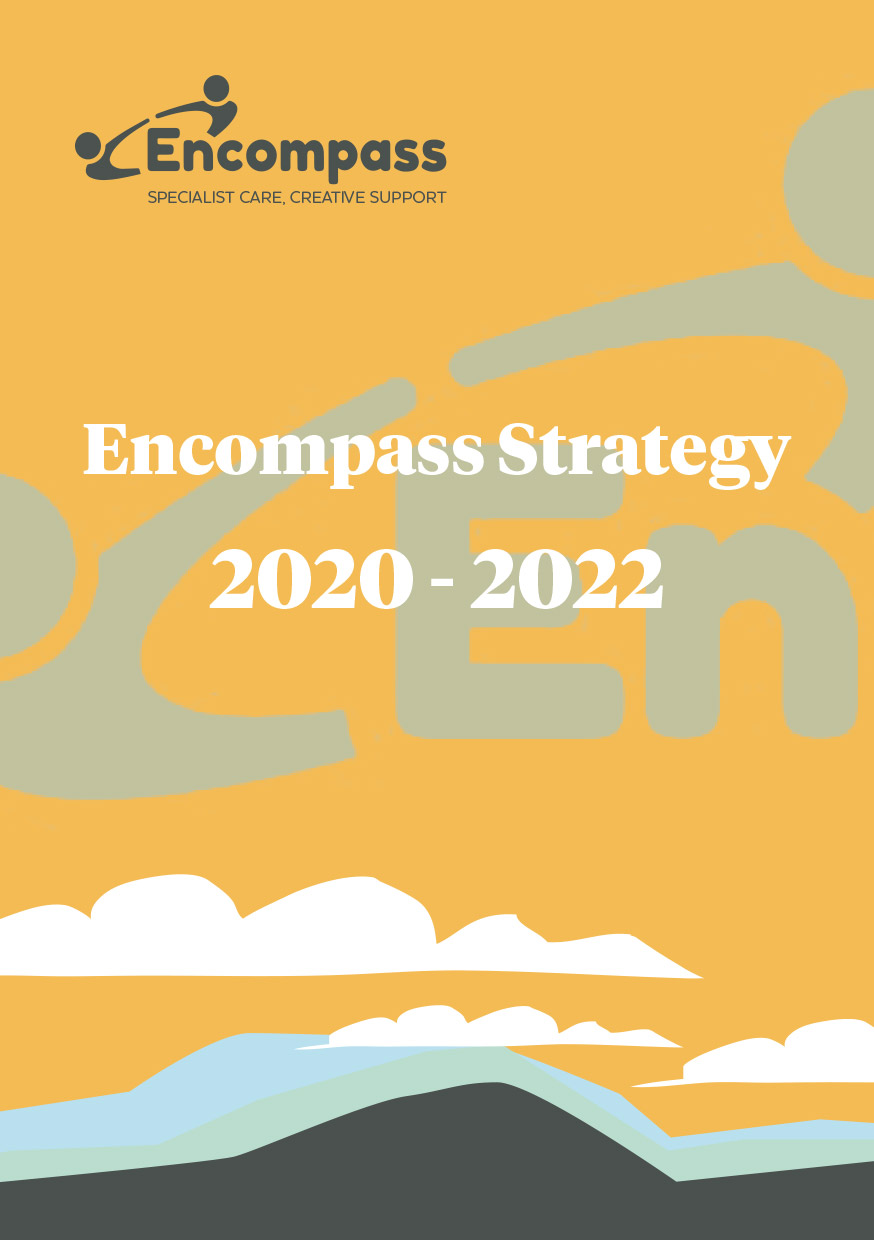
The document was envisaged as a 16 page A6 pocketbook - to be printed on uncoated paper for a litho print. The client provided no real guidance as to what style they wanted, but did provide a comprehensive outline of content. To kick things off, I looked at the existing material they had mostly comprising of a website and a logo they had designed for the website. The client informed me that the colours chosen by the original designer had not gone down too well with some members so they were looking to create a new set of choices. I put together a colour board and we selected a choice from that - a collection of Mustard Yellow, a charcoal, plain white, and some pastel blues and a green.
Once this was done I was able to move on with a basic font choice and concept image idea. I went for some illustrated mountains and clouds - it had to be something not too specific but meaningful, a bit restful and so on, so it seemed a good choice. I used a simple combination of two serif and sanserif fonts so as it not make it too corporate and hard faced, but still legible and accesible.

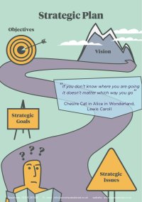
After we had agreed the font cover it was simply a case of extending the style and font usage to all of the content they had provided me with. later stages we added photos which gave it a bit more of a catalog feel, but there was a bit of opportunity to add some hand illustration like the mountians and a single page illustration of an objective with some smaller diagrams.


